Can you really match a Pantone color to a Sherwin Williams paint swatch?
March 21, 2018by ContempoE-Newsletters
Here at the firm, we’ve been working on various interior and exterior signage and wall graphic projects. In most cases, that work has been part of an overall “refreshing” of our clients visual branding materials, and integrating all of their branding materials—print materials, online and their new or renovated spaces.
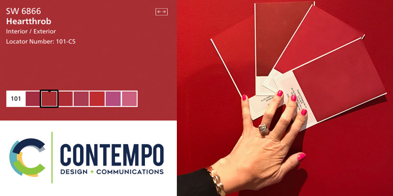
For one particular client project we were tasked with matching a red wall in their office that was painted with a flat finish Heartthrob – SW 6866. The goal was to ensure that the wall color would match their other identity materials including business cards, letterhead and envelopes. The color was the key.
We set out to match this existing color with a Pantone color and, well, it wasn’t that easy. Here are some steps and tips if you’re going to go the extra mile and try to match a Pantone color with a paint swatch:
- Right off the bat: The color match for the Pantone and the paint will vary whether you’re using an uncoated paper stock or a glossy finish
- The finish of the paint matters too—eggshell, satin, flat, etc.
- Just grabbing your Pantone and SW swatch book alone won’t work.
- Best option, and the solution that worked for us in this case, is to take your Pantone book, uncoated if the stock that is being specified for the print job will be uncoated, (in this case we were printing on 24# Writing Classic Linen) and put the Pantone book right up against the finished/painted wall and you should be able to find a “perfect” match.
- We went the extra mile and had draw downs made of each color that I thought was close to the wall color and, voila! In this case our closest and almost exact match was Pantone 1805 uncoated.
Believe it or not the whole process, with the matching, draw downs and printing, took four weeks!
We followed this same process several years ago when we were working with the Cleveland Indians on the Kids Clubhouse space at Progressive Field. The closest SW navy paint to the Indian’s Pantone 289 is SW NAVAL, a color I liked so much it now appears in our offices and my son’s room.
Color is important. It makes a statement about identity. It affects people in subtle ways. It even communicates mood and emotion. So don’t cut corners when it comes to selecting colors, and go the extra mile to make sure you get it right.
Here’s the end result of our quest to match the wall color with the finished identity pieces!
Happy matching!
