Refresh and Renew Your Brand
April 30, 2018by ContempoUncategorized
When was the last time you gave your brand a refresh or an update?
Your run a business and you’re busy. We understand. Every so often we recommend taking a look at your brand, and all of its elements.
A good start to this process is taking close review of your brand standards manual or guidelines. (You have one, right?)
A standards manual or brand guidelines document keeps things consistent and it can also simplify the design process when working with your internal or external design professionals. Your guide helps the design team keep things standard – the way you envisioned them when you created your brand identity.
If you don’t have one, there’s no better time to start. Some standards manuals consist of just a few pages, some might have 100+ pages depending on the needs of your company. Just dive in and get started with these five elements:
Logo usage. It’s so important to specify the “do’s and don’ts” of your logomark. If you don’t, you’ll could find your logo being tilted, skewed and reversed out in ways you never thought possible. See the examples below of how to use, and not use, the Indians logo mark straight from their standards we created in 2011. 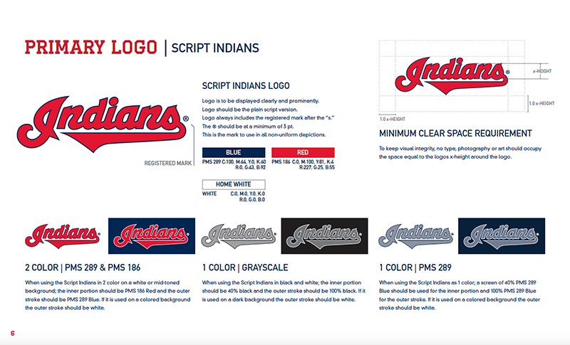
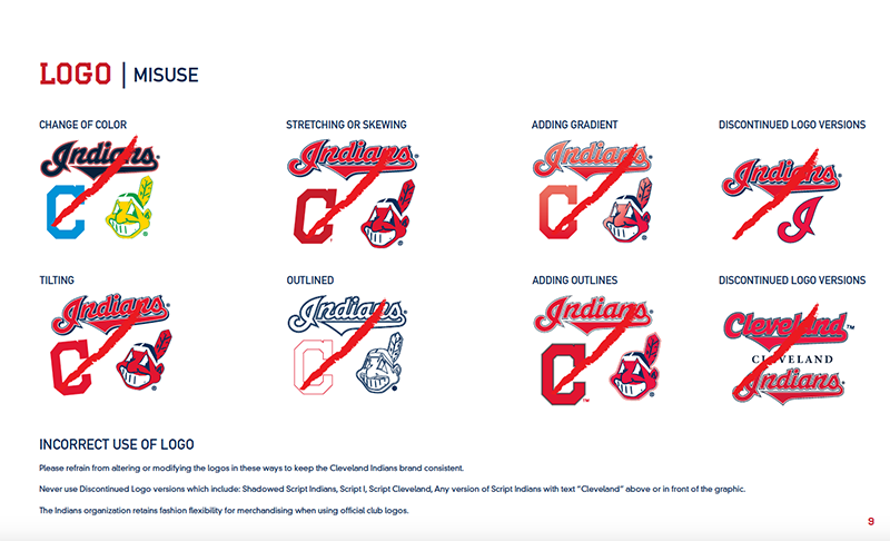 Font standards and usage. Whether you’re you need of a custom font or are utilizing the most popular for your industry or business, consistency is key. You should select a main font for headlines, a sub headline font, an initial cap style, body copy and letter or Word document font selections and styles at minimum. See below for an example of font usage we developed for Fleet Response.
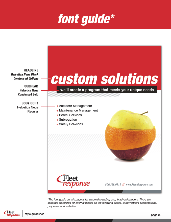
Color palettes. Have an established primary and secondary color based on Pantone’s for print, and RGB or Hex color coded for online. There are so many variances with color based on how monitors and printers are set up, and that is why you must be certain the Pantone colors and Web colors that you’ve chosen are consistent for ALL materials. Color is important, so make the color portion of your standards guide book a priority. Reds, greens and blues tend to be the most challenging to match across all mediums. As an example here’s a color palette we created for RG DRAGE, a vocational school in Stark county.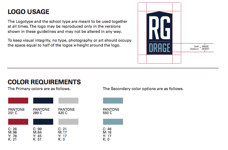
Image usage. A picture is, literally, worth a thousand words. Some companies might use only black and white close ups of custom photos. For others, highly illustrative and colorful drawings, sketches of characters or infographic style imagery reflect their brand. Whatever you choose, keep it consistent. An example of Image and graphic standards can be seen here, these were created for the Cleveland Indians in 2011. 
Brand voice and writing style: Your brand voice and writing style should be just as identifiable as your company’s logo. A brand voice is the tone of a company’s communications and, without established and clear standards, you could find that different “voices” are present within the same document or website. Your style guide should give clear directions on how to put your brand into words, as well as what to avoid. Also include guidelines that cover grammar, punctuation, spelling and usage. And be sure to include about any tag lines or other phrases associated with your brand.
There are other items to consider including how your brand identity is presented in PowerPoint presentations, proposal templates and even in your letters and emails that you send out to customers, prospects and donors. Your brand partner should be able to direct you on these other pieces, but make sure you address the five items we’ve outlined here.
If you don’t have a set of standards and want to refresh or build a complete brand identity, Contempo can assist with strategy and implementation for your existing or new brand style guide. Email me at [email protected] if interested in a consultation.
